
Design and code for PADLab (Post-Anthropocene Design Laboratory) PADLab is an environmental-social design lab exploring relationships between humans and the non-human world. Through workshops, installations, exhibitions, and research, the lab develops experiences that connect people with nature and, through nature, with one another. The website is designed as a flexible visual framework that reflects the lab’s interdisciplinary approach. Combining a structured typographic system with diverse visual content, it creates space for different forms of research, experimentation, and documentation to coexist. https://thepadlab.org/

Book design for “Noah’s Musings: Dialogues with Noah Waldman Pinkus” A collection of short stories and conversations gathered between the ages of 2 and 13.

Visual Identity for the exhibition “From the Collections of the National Library”. First exhibition outside its Jerusalem building. Installed across two major light rail stations, the project transformed reproductions from the library's collections into large-scale public displays, bringing cultural archives into the everyday urban environment. Designed at The League Studio. Photography: Hana Taieb, courtesy of the National Library of Israel

Visual Identity for the Tel Aviv Biennale of Crafts and Design 2026. The 3rd edition of the Tel Aviv Biennale of Craft and Design returns in 2026 under the theme Works and Days, drawn from Hesiod’s ancient Greek epic poem. This timeless reference frames the concept of “work” in its broadest sense – not only as labor and craftsmanship, but also as action, agency and ethical responsibility. The visual identity draws on ideas of duration, labor, craft, materiality, and process through layered compositions and a visual language that moves between the mechanical and the handmade, the ordered and the fragmented. Approaching time as something accumulated through action and repetition, the design reflects work as an ongoing and material act. Designed at The League Studio. Photography: Daniel Hanoch

Trilingual brochure for the Tel Aviv Biennale of Crafts and Design 2026. The 3rd edition of the Tel Aviv Biennale of Craft and Design returns in 2026 under the theme Works and Days, drawn from Hesiod’s ancient Greek epic poem. This timeless reference frames the concept of “work” in its broadest sense – not only as labor and craftsmanship, but also as action, agency and ethical responsibility. The visual identity draws on ideas of duration, labor, craft, materiality, and process through layered compositions and a visual language that moves between the mechanical and the handmade, the ordered and the fragmented. Approaching time as something accumulated through action and repetition, the design reflects work as an ongoing and material act. Designed at The League Studio.

(Unchosen) Sketches for Jerusalem Design Week “Match Point”. The theme of this edition, examines sports arenas as contemporary cultural spaces shaped by rules, competition, and collective emotion. Through design, architecture, objects, and body-related technologies, the theme explores how sport constructs identity, belonging, power, and modern ritual. Designed at The League Studio.

Poster for Batsheva Dance Company's Project 48 Dance, inspired by the story of Noah’s Ark, imagined as a temporary refuge and a space for continuity, creation, and life amidst turbulent times. The project itself was approached as a kind of “ark” within the surrounding instability. Designed at The League Studio.

Open Call for Jerusalem Design Week “Match Point”. The theme of this edition, examines sports arenas as contemporary cultural spaces shaped by rules, competition, and collective emotion. Through design, architecture, objects, and body-related technologies, the theme explores how sport constructs identity, belonging, power, and modern ritual. Designed at The League Studio.
A series of animations for Batsheva Dance Company’s playlists, each curated by a different member of the company’s creative circle, including dancers, DJs, and choreographers. Designed at The League Studio.

Book Design for Batsheva Dance Company. A small editorial project created for the farewell of Batsheva’s CEO, bringing together poems by different poets into a single printed booklet. The publication combines text with illustrations, stage imagery, and archival materials, forming an editorial document that reflects on the company’s cultural landscape. Designed at The League.

Poster redesign for Sadeh21 by Ohad Naharin, performed by Batsheva Dance Company. The piece is one of the most talked-about and remarkable works in Batsheva’s repertoire.

Poster template for Bimot Pais, a concert series held across Israel. Designed for local municipalities to adapt to their own events. Inspired by public notice boards, using bold typography and ticket-like graphic elements.

Graphic Design for the installation “Observation: 100 Years of the Geddes Plan” The work reflects on Geddes’s idea of observation as an active, reciprocal act. The book, positioned at the center of the table, can be read from both sides, turning the observer into the observed. Only by walking around it—completing a 360-degree movement—can one grasp the full scope of its content, transforming reading into an embodied act of seeing. The installation curated by Tsuf Bar On and Yssaf Ohana for Bezalel Academy & Liebling Haus. Developed as part of the academic collaboration between Bezalel’s School of Architecture, the Department of Urban Design, and the Liebling Haus, the exhibition brought together student projects created around the theme of 100 years of the Geddes Plan. Photos: Hadas Hay

Design and code for Connecting Stations Studio. Connecting Stations is a cross-ethnic, interdisciplinary activist studio of designers, artists, and educators. The group creates design-driven experiences that train diverse participants to adopt new perspectives and open channels of communication across divides. Its members, Jews and Palestinians alike, share the conviction that, now more than ever, empathy, trust, and open dialogue are essential foundations for sustainable peace. Importantly, the insights and practices developed in this context can also inspire, and be directly applied to, divided communities worldwide. https://connectingstations.com/

Flyer for the 25th anniversary of the Sapir Prize for Literature. One side presents the event program, while the reverse features an archive of all 25 winning books, arranged chronologically from 2000 to 2025.

Dissolving Borders is a poster created for a poster exhibition at 4Tress, under the theme “The Event That Never Happened.” The exhibition explores events that have yet to take place—dreams, aspirations, and moments we hope will one day become reality. Dissolving Borders imagines a world in which national borders disappear, leaving only natural geographical distinctions between places: land, sea, ice, and beyond.
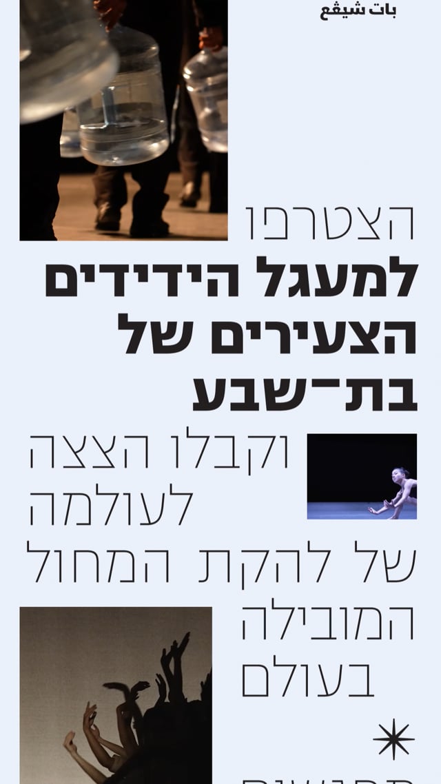
An animation for Batsheva Dance Company’s Friends Circle. Through a series of glimpses into the company’s creative work, the piece brings together movement and imagery from Batsheva’s performances. Designed at the League Studio. Motion: Michael Berković

Website design for OF/WHITE, a residential concept by Ofer Investments, developed in collaboration with architect Gidi Bar Orian. The project offers a contemporary approach to urban living in Tel Aviv, combining the city’s unique architectural character with green spaces, flexible living environments, and shared areas for work and leisure. Designed at Two Design Studio.

Poster design for Estate, a film by Eilon Bar Tal. Since most of the film takes place inside a house, the poster incorporates its architecture into the composition. The dark atmosphere, unusual framing, and obstructed view of the main character create a sense of tension and discomfort, reflecting the film’s themes of family conflict, secrecy, and belonging.

Poster design for Podium, a platform for works by dancers of the Batsheva Ensemble. A podium is a small stage or a platform slightly elevated from its surroundings, serving as a stable platform. It is a minimal base that allows us to share ideas, experiment, and briefly shine a light on what intrigues, stimulates, and occupies us. Designed at The League.

Book Design for PADLab: “Navigli Edition: More Then Humen City Guide”. This Guide offers an alternative—or a complementary supplement—to traditional tourist guides by shifting focus from a human-centered view to one that prioritizes the perspectives of local non-human entities. PADLab was established in 2022 in Shenkar Engineering. Design. art. Tel-Aviv in collaboration with the program of Information Experience Design at The Royal College of Art (RCA) London. Photos: Shalev Ariel

A series of posters celebrating one million published websites created with Wix AI Website Builder. Through repetition, color, and variation, the posters reflect the wide range of design possibilities offered by the tool, highlighting how each website can be customized into something unique. With Shai Blau.

Visual Identity & Archive Resaerch for an Installation by PADLab: “Distribution Station”: artistic-design installation created in response to the growing human-environmental rupture since the events of October 7 and the outbreak of the war. The installation was set in a mill—a space historically used for gathering and grinding wheat—and transformed into a hub for seed distribution and a practice of empathy. By juxtaposing burnt wheat, symbolizing the destruction and suffering of communities in war, with sprouting wheat, representing the prosperity of nations on their land, the project sought to explore themes of destruction, recovery, and growth. Brochure Photography: Shalev Ariel / Installation Photography: Shira Rotkopf

The Book “Collection of Walls” examines the meaning of the concept of "home." The home portrayed within its pages is neither a structure nor a place but rather a response to internal and external conditions and processes. The guiding principle in the book's design is defamiliarization through disruption. Uniformity in design is abandoned in favor of creating a reading experience that emphasizes the editorial process. The page layout changes from chapter to chapter, and the typographic structure shifts to match the text. This is a collection that does not attempt to define "home" but instead highlights the discomfort inherent in the concept and how easily social and natural processes can destabilize it. Diploma Project at Shenkar College of Design & Art. Photos: Noam Debel & Achikam Ben Yosef

Website design for MA.S, an architecture and interior design studio founded by Meital Mayorchik Sarid. Reflecting the studio’s approach to combining old and new, the website draws inspiration from archival aesthetics, using structured layouts, typographic details, and a catalog-like approach to presenting projects. These elements are balanced with a contemporary visual language, highlighting the studio’s attention to materials, textures, and architectural details. Designed at Dafna Bloch Studio. Development: Eli Cohen. https://mas-archstudio.com/

Website design for Muhlbauer Architects, an architecture firm working across a wide range of fields and scales. The website was designed to highlight the diversity of the firm's projects while maintaining a clear and cohesive visual language. Building on the orange circle from the firm's existing identity, the design transforms it into a recurring graphic element that helps define the website's structure and navigation. Designed at Two Design Studio https://www.ome.co.il/en/

“The Next Book” explores aspects related to language and their variations across cultures and countries, with a specific focus on the cultural contexts of Korea, Germany, and Israel. It is organized into chapters and utilizes color-coding, where the primary colors (blue, red, and green) symbolize each respective country. Additional colors are employed to demarcate the chapters. The book comprises five chapters, each delving into distinct facets of language. Collaboration with Soeun Jeon.

The Lexicon of Elly Gross is a catalogue exploring the life and work of Elly Gross, an independent designer known for her distinctive approach to calligraphy and Hebrew letter design. Structured around the Hebrew alphabet, from Aleph to Tav, the book tells her story through the letterforms she created. Each letter represents a significant moment, value, or aspect of her life and creative practice.

Website design for White City Group, a real estate development company shaping Tel Aviv’s urban landscape. Designed around the idea of the “White City” as a blank canvas for urban creation, the website uses a clean, spacious layout, large-scale architectural imagery, and a clear typographic hierarchy to showcase the group’s diverse projects and areas of expertise. Designed at Two Design Studio. https://www.whitecity.co.il/